Winter 2026 Chart Battle
It's that time of year again...with some exciting news from me at the end

When I started teaching energy economics in the Department of Economics at the University of Alberta, I built a lot of R into my class from day 1, and it has remained a very important part of my teaching. I use R data exercises and assignments to familiarize my students with techniques in data visualization while, at the same time, reinforcing the energy concepts we learn in class. I use a few different data sources through the term: the (formerly) BP Statistical Review, Energy Information Administration (EIA) price and trade flow data, Canada Energy Regulator Energy Futures scenarios, solar power using data from my own household array, and Alberta electricity loads and prices using the AESO API.
Each term, I set the last assignment to be a submission inspired by Jason Kirby’s annual economists’ charts week, and have them pick a chart that they find interesting and which tests their R skills. They are graded on originality and degree of difficulty.
Things have changed a bit with the advent of AI tools like ChatGPT and Claude, but I have to say that my experience with it in the classroom has remained positive. While students can, of course, rely too heavily on these tools, I believe that this disadvantage is overcome by just how accessible it makes coding for beginners. My students, if they take the time to do the work, leave the class with the confidence that they can produce brilliant data visualizations in R, and that is a win for me.
You can see all of this term’s charts here.
Many of my students have shared contact info, mostly via LinkedIn. Please reach out to the students if you like their work. Hire them if you have a job opening. Pass their work on to others who might want to see it. And, if you don’t like a chart, please keep it constructive or keep it to yourself. I want them to feel great about the work that they’ve done.
Let me highlight a few charts that I really like and tell you a bit about why:
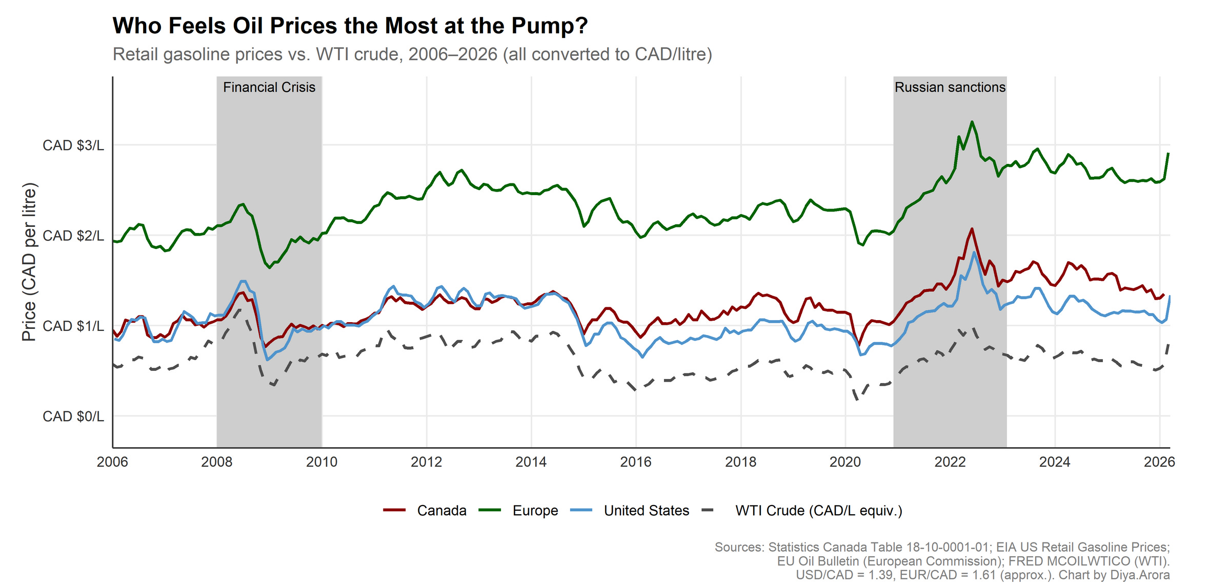
First, I really like this chart from Diya Arora, a graduating Honours student in economics who is off to grad school at UBC in the Fall. Diya’s chart is timely, clean, and really captures the role of global economic conditions, crude prices, and local markets and taxes in setting gasoline prices in Europe and North America.
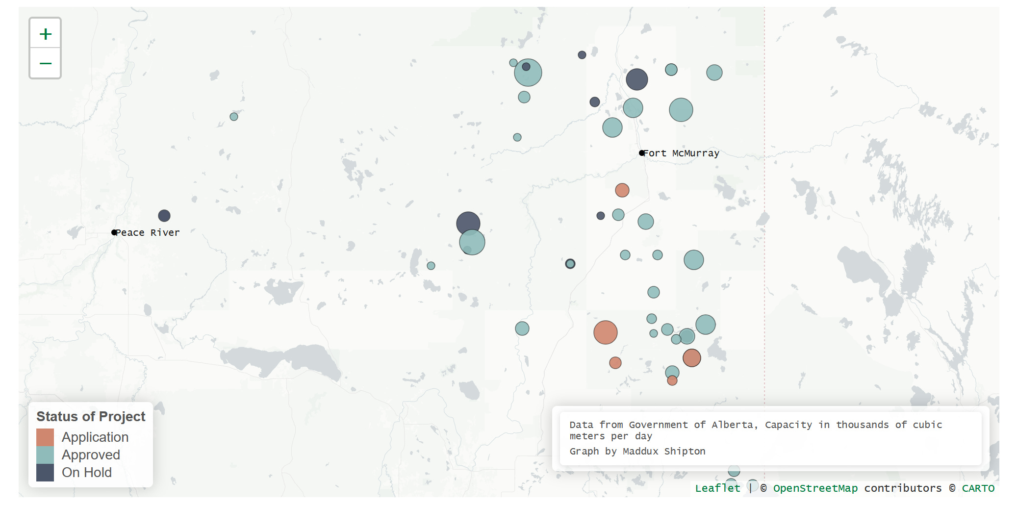
Maddux Shipton took on mapping all of the potential oil sands projects in Alberta, including those approved, on-hold, or in the application phase. If you read Maddux’s write-up, you will see why this map might soon be on a wall near Premier Smith’s offices at the Legislature.
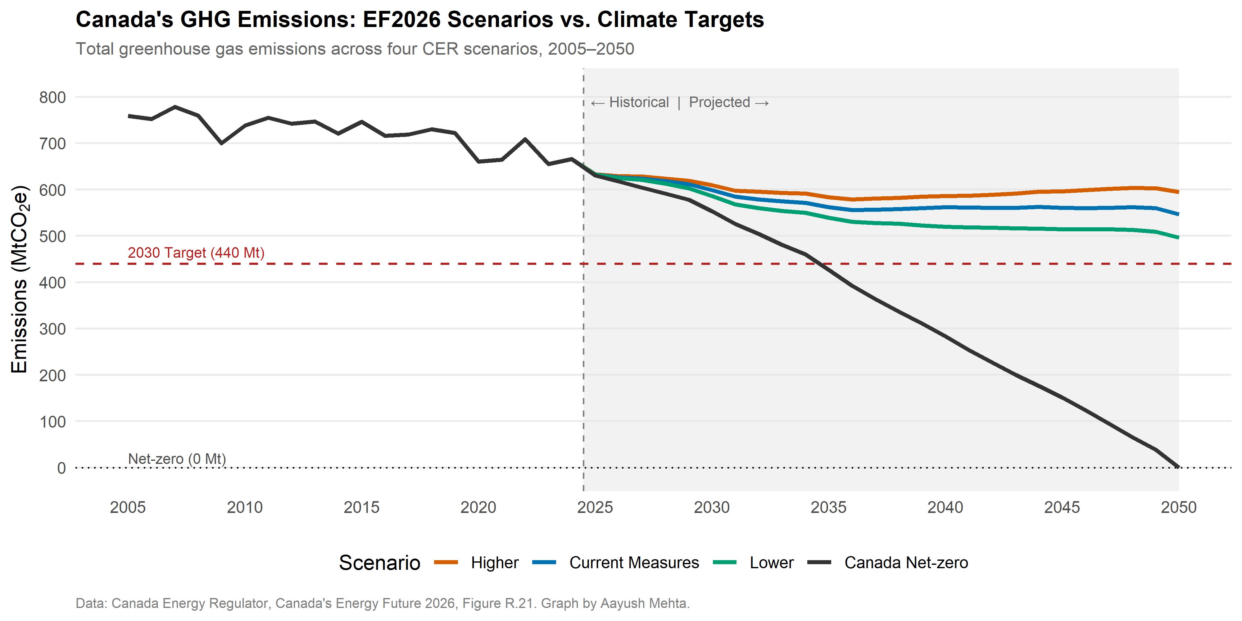
This graph, from Aayush Mehta is a nice visualization of historic emissions, targets, and projections from the Canada Energy Regulator. It also really shows how much more stringent Canada’s policies are likely to have to be to meet our net-zero goals by 2050.
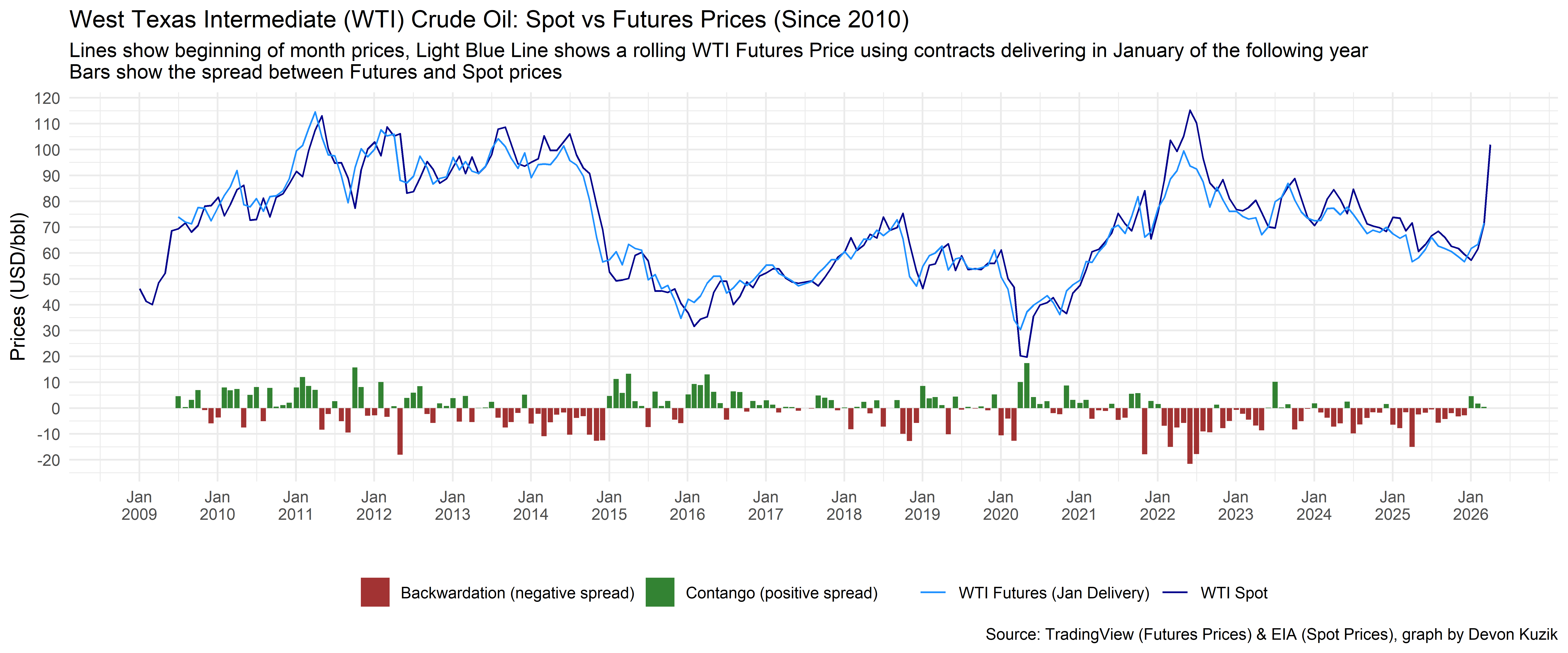
Finance student Devon Kuzik, from whom I learned more than a few things this term, has a great visual of WTI spot vs. futures prices which includes my two favourite words in energy finance: contango and backwardation.
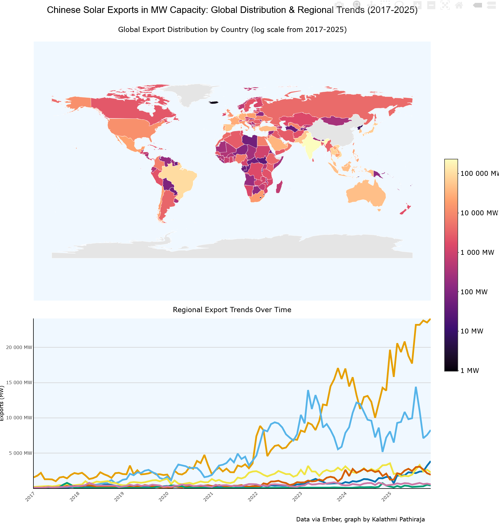
The graph above you really need to see on the live html site, since Kalathmi Pathiraja has built-in mouse-over info for data showing how Chinese solar panel exports have been distributed across the world.
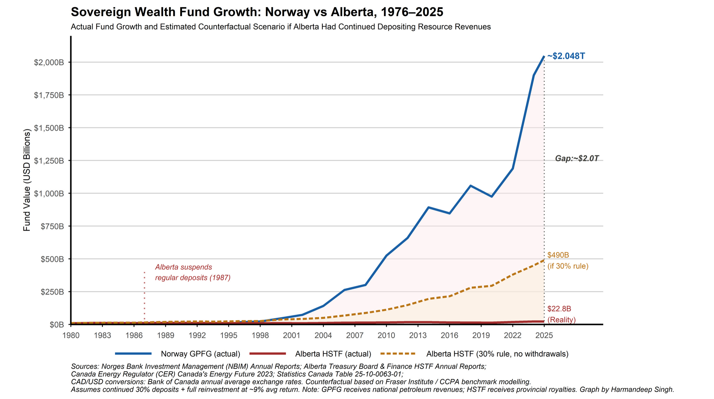
This year’s award for inadvertently (?) trolling your professor goes to Harmandeep Singh for this graph of growth in Norway’s sovereign wealth fund compared to Alberta’s Heritage Fund. There was no Norwailing warning on the assignment!
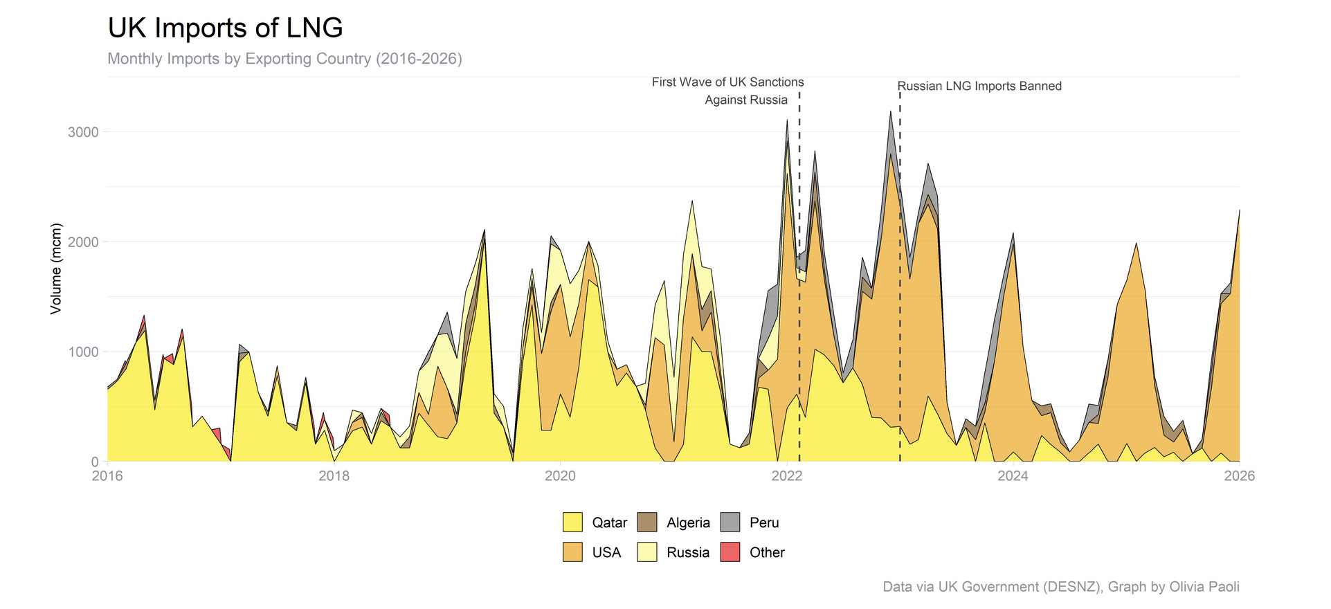
Exchange student Olivia Paoli shared some really neat data I had not seen before on UK LNG imports and graphed it to show the impact of sanctions against Russia. One of my favourite parts of this class is that it attracts students from all over the world who are interested in energy policy.
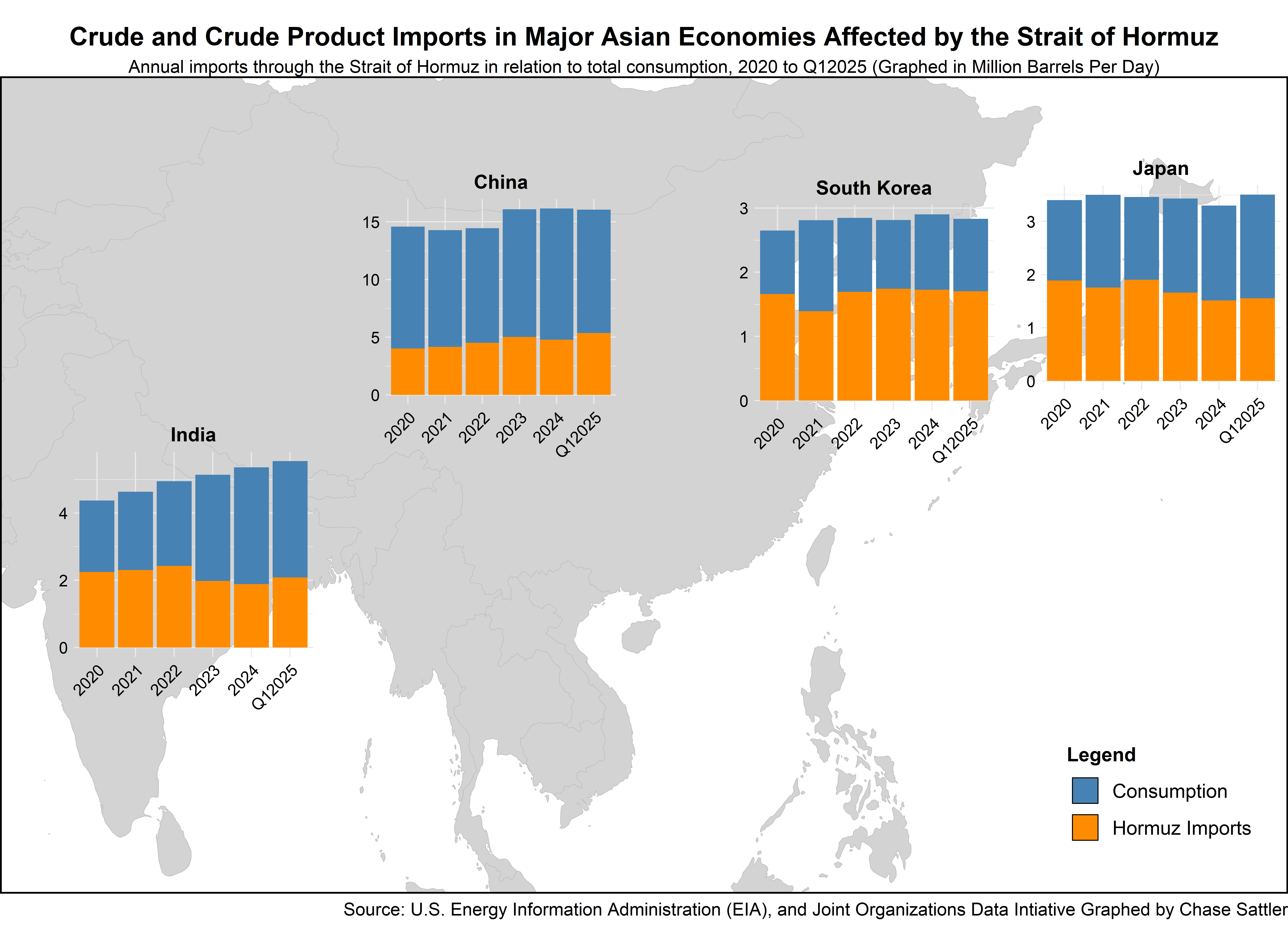
With a big data assist from energy chart guru Rory Johnston, Chase Sattler provided a timely (at least for now) visualization of the dependence of Asia-Pacific countries on imports moving through the Strait of Hormuz. The map/graph combo is great, and it was fantastic to be able to connect Chase with Rory for help that I could not provide.
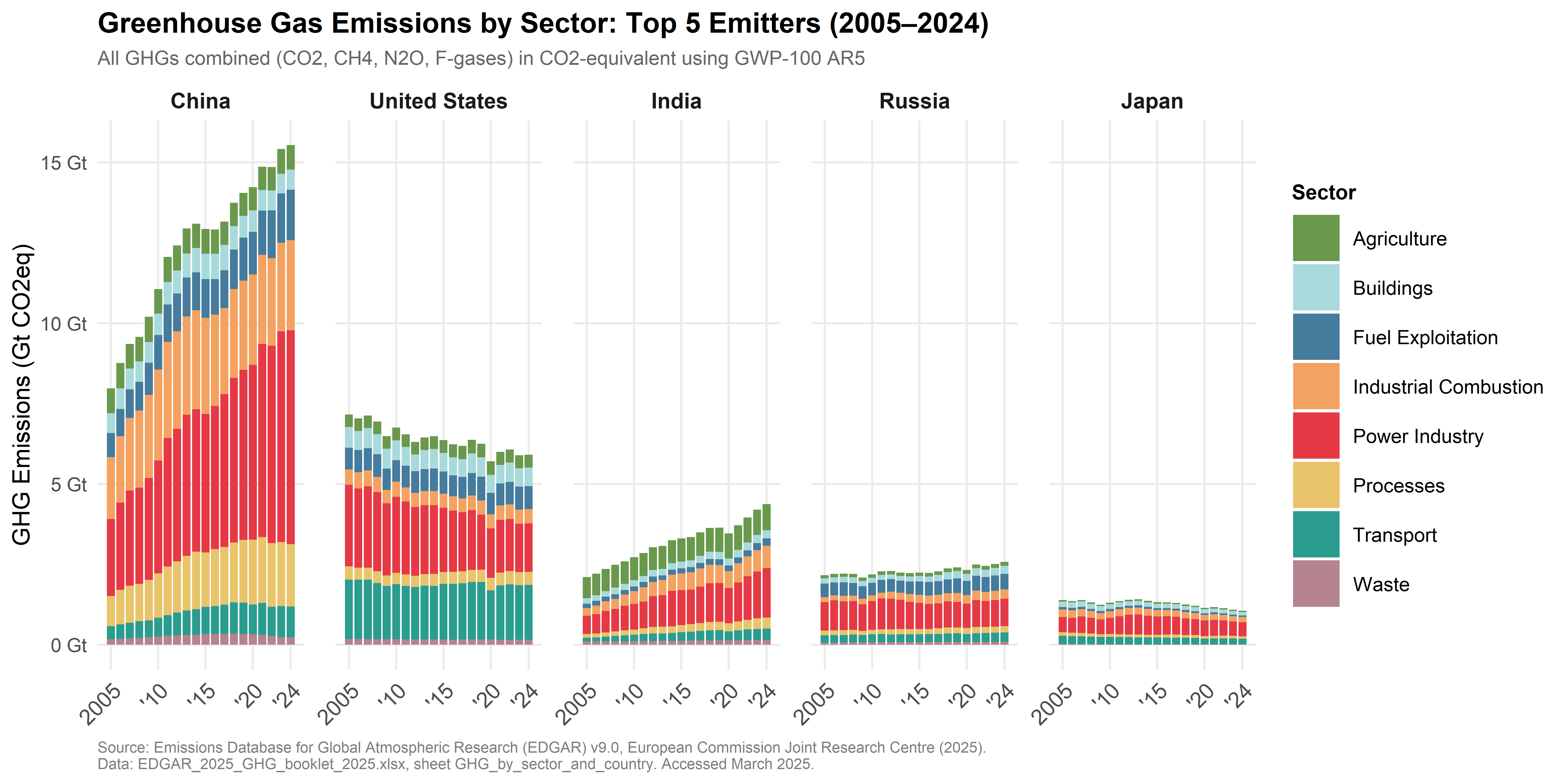
And, Caitlyn Hajjar put together a really nice visualization of sector-level emissions from world’s five largest sources of greenhouse gases. The side-by-side comparison of China and the US is really quite striking!
And, there are many more. Check them all out in the Charts Week portfolio. You can even see a graph from Ty Glowach who asked if he could do a graph about soccer and, well, if it gets you using R, why not?!?
Finally, some exciting news: for the first time, I will be teaching an open-enrolment energy literacy course at UAlberta.
The fantastic poster below was created by Caitlyn Hajjar, who also has the GHG emissions by sector graph shown above. I’ll have more details on this soon, but please register and/or pass this around to interested potential students!

Great stuff!
Thank you, not just a win for you, but for everyone who takes the time to examine all these charts.