Winter 2025 Chart Battle
Some of my University of Alberta Econ 366 students submitted fantastic charts for your enjoyment
When I started teaching energy economics in the Department of Economics at the University of Alberta, I built a lot of R into the class from day 1, and it’s remained a very important part of my teaching. I use R data exercises and assignments to familiarize my students with techniques in data visualization while, at the same time, reinforcing the energy concepts we learn in class. I use a few different data sources through the term: the (formerly) BP Statistical Review, Energy Information Administration (EIA) price and trade flow data, Canada Energy Regulator scenarios, solar power using data from my own household array, and Alberta electricity loads and prices using the AESO API.
Each term, I set the last assignment to be a submission inspired by Jason Kirby’s annual economists’ charts week, and have them pick a chart that they find interesting and which tests their R skills. They are graded on originality and degree of difuculty. Importantly, for many, this is a bonus assignment: it’s not worth anything if they already have good R assignment scores. Some, despite that, put together some really great work. And, if you know students that are taking my class and you don’t see their work here, it almost certainly means they’ve done really well on their other data assignments and are prepping for their other finals instead of doing extra R work.
You can see all the charts here.
Many of my students have shared contact info, mostly via LinkedIn. Please reach out to the students if you like their work. Hire them if you have a job opening. Pass their work on to others who might want to see it. And, if you don’t like a chart, please keep it constructive or keep it to yourself. I want them to feel great about the work that they’ve done.
Let me highlight a few charts that I really like and tell you a bit about why:
First, I absolutely loved this chart from Enzo Capenakas, but you have to go to the original to see its full excellence since he’s used Plotly to make the chart interactive. The impact of the tariff annoucements really jumps off the page, but so does the post-election optimism about a Trump presidency. It’s not a complicated data visualization, but it really gets the point across.
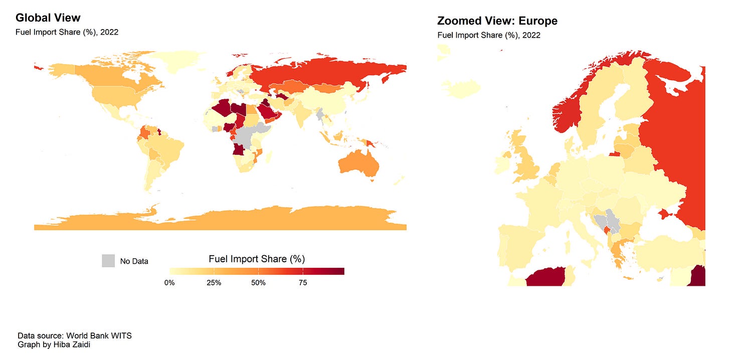
I also really liked Hiba Zaidi’s map of World Bank data on trade flows. The particular data, import shares of all fuels, has some really counter-intuitive outcomes (Russia and Norway with high import shares?) but the data say what they say and the important skill that Hiba gained here was the pushing of data onto a map, something we don’t do in class. Her motivation, thinking about energy security, is also very timely.
Finally, I really liked the idea that Payten Semeniuk had in this figure, to show the sources of changes in emissions over time (I almost always think about levels). This graph (it also uses Plotly mouse-overs if you check the original) really highlights not only the sectoral changes but the technology deployment required to meet national goals and/or changes we might see in Canada if the world acts aggressively on climate change. Payten also gets a shout-out because she put together a really nice graph theme that I’ve adopted for some of our class work.
Check out the rest of the charts here. And let us all know what you think.


Perhaps some students could use a lesson in remedial geography if they are in the business of making maps - like the fact that Crimea is not Russia as it is portrayed on this map? It would be great if this disinformation didn't get pushed to the university community and beyond.
I like I like the spices of forecast decline because it show much we are betting on direct air capture, which is horrifying.