
Our charts and stories for this week are posted at https://aleach.ca/charts.
Our students have stories on the world’s largest wind farm, solar tariffs, renewable investment requirements, and transparent solar panels.
There are few better weeks in an energy-chart lover’s life than the release of the IEA’s World Energy Outlook. It’s up there with Michael Liebreich’s annual outlook decks and, of course, the EIA’s Annual Energy Outlook.
This year, the IEA had a few very interesting graphs to choose from, and I’ll highlight the most striking one here.
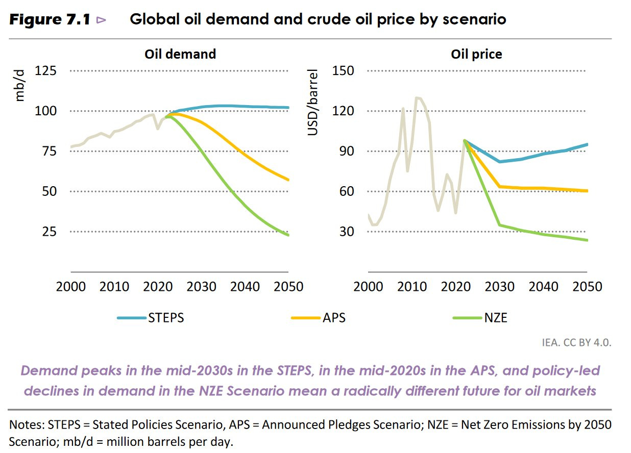
This one really sets the tone for me, since it shows that oil use is highly sensitive to climate action, but that even absent further aggressive action on climate change, oil demand has effectively peaked. For more, check out Caroline Lee’s thread on Twitter:


Another shot across the bow of the fossil fuel industry came this week from the IISD, arguing that new fossil fuel development is incompatible with 1.5C scenarios. Unfortunately, I don’t think that’s what the data they use actually show. While it’s true that median oil, gas and coal use are decreasing across all of the 1.5C scenarios tested for recent IPCC reports, that does not generalize to all such scenarios. This is more stark for gas, and less so for oil.
For oil, there are no scenarios with both aggressive climate action and increasing oil consumption beyond 2040, and for a 1.5C lens, there are none with increasing oil consumption at all.

This is not true for gas. In the two leftmost panels below, there are scenarios with both a doubling of gas consumption from current levels and aggressive action on climate change. The median and the mean still decline, but the range is much wider.

That’s not to say that we should discount the role of other technologies - they are essential in all scenarios. It’s just that the median and the mean tell you only part of the story.
https://open.substack.com/pub/finiche/p/portfolio-insights?r=1s05vd&utm_medium=ios&utm_campaign=post
I bet a case of Molsons that we the actual oil demand is just below STEPS estimate. Love the simplistic chart. Keep up good sharing.