
November 11
November 11
Oil and war, the EIA STEO and the AER ST-3, Alberta electricity bills, and COP27

Our weekly energy charts are posted at https://aleach.ca/charts.
Our students have stories this week on US emissions offsets, the cost of financing the energy transition, and an update on COP27. I have to say, COP week is not my favorite time of the year: too much adversity and conflict, especially in a year when there isn’t a major negotiation milestone.
I hope you’ve all had some time to reflect on this solemn day of remembrance. Among other things, I did a little reading today on the link between oil and the two World Wars, and came across this piece by Timothy C. Winegard, author of The First World Oil War, that you might find interesting. Energy, in particular oil, gas and refined products, remain critical strategic resources today, as the people of Europe are being reminded of on a daily basis as winter sets in.
Another link between energy and the Second World War, via Pius Rolheiser on LinkedIn: “Imperial’s Kearl Oil Sands operation and Kearl Lake in northern Alberta are named in honour of Flight Lieutenant Eldon Eastham Kearl. Born in Cardston, Alberta, Flight Lieutenant Kearl was a pilot in the Royal Canadian Air Force during World War II. He was killed in action on his 24th birthday, Jan 27, 1944, and was posthumously awarded the Distinguished Flying Cross for service to this country.” Lest we forget. I was unaware of this connection until today, so thanks, Pius.
Finally, a shout out this week to the Daily Oil Bulletin on their 85th anniversary. The JWN group have been really good to us over the years, from hiring our students to sharing data and subscriptions for academic use. Happy anniversary!
Now, on to the bonus charts.
In the second week of the month, we always celebrate the release of the EIA Short Term Energy Outlook projections for the month. As ever, I am focused on the ever-flattening oil demand outlook. In the longer-term graph, the changes don’t appear that dramatic, although it’s still clear how much of a downward shift we’ve seen since the pandemic. However, the 2023 outlook is now effectively flat which represents a significant revision from earlier forecasts.
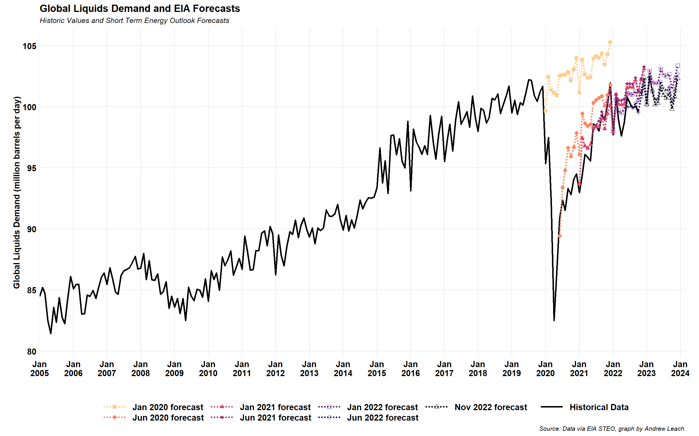
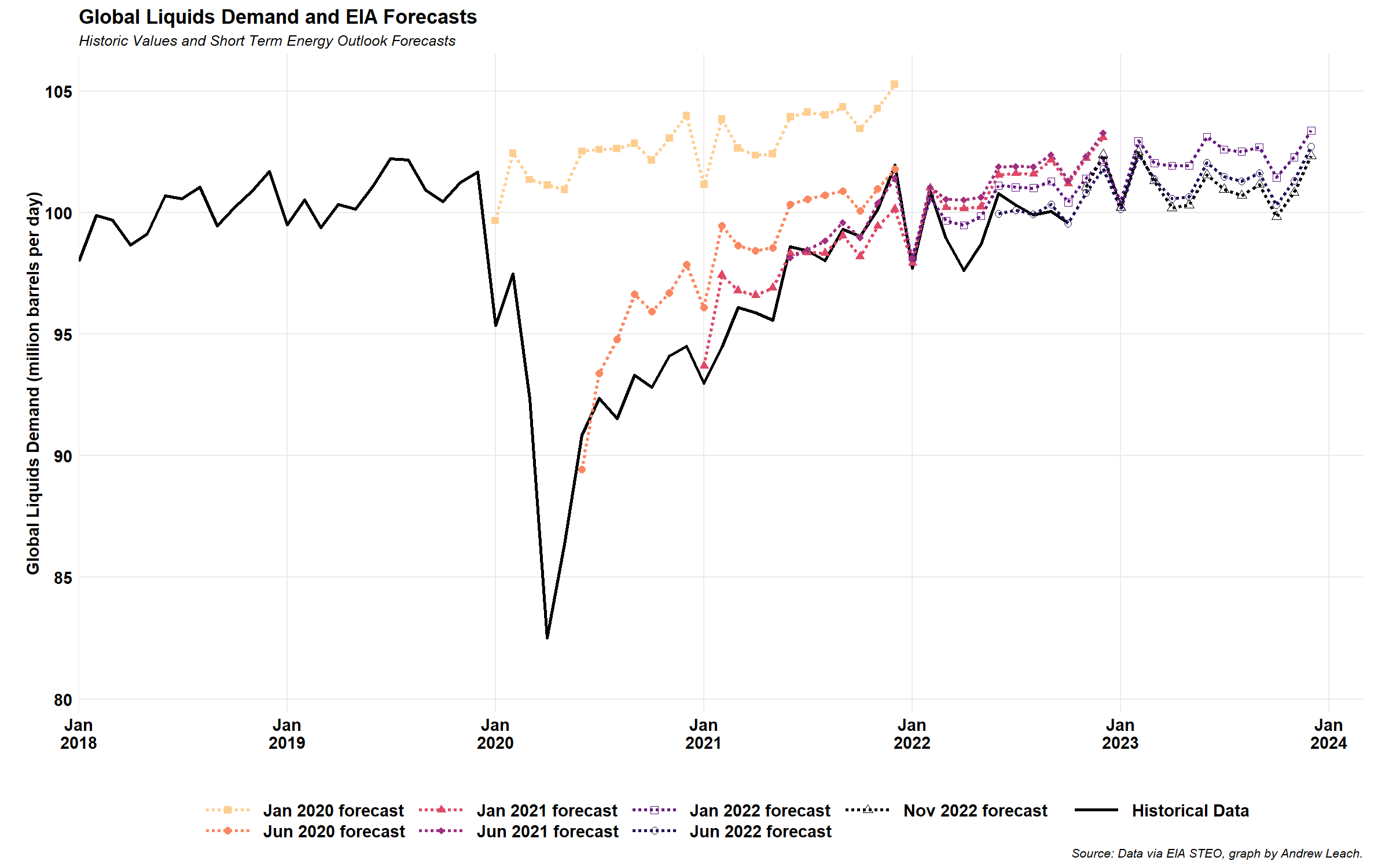
You can see this much more plainly on a zoomed-in graph. In January of 2020, the expected growth was about 2.5% per year through 2022. From December of 2022 through December of 2024, the forecast is basically flat, and the most recent forecast is the lowest we’ve seen for a while.
There was also a lot of talk this week about electricity bills, as Premier Danielle Smith promised to take action to lower “transmission and distribution costs.” This, from Blake Shaffer, was a bit of an illustration of what’s really driving costs in Alberta right now.

Although, as many including myself pointed out, distribution costs are much higher in rural Alberta. This, from a C.D. Howe Institute report by Grant Bishop, Mariam Ragab and Blake Shaffer, shows how much higher non-energy charges were for ATCO service area customers (at least in 2019). We’ll wait for charts readers Grant and Blake to update this chart and share it with you when they do!
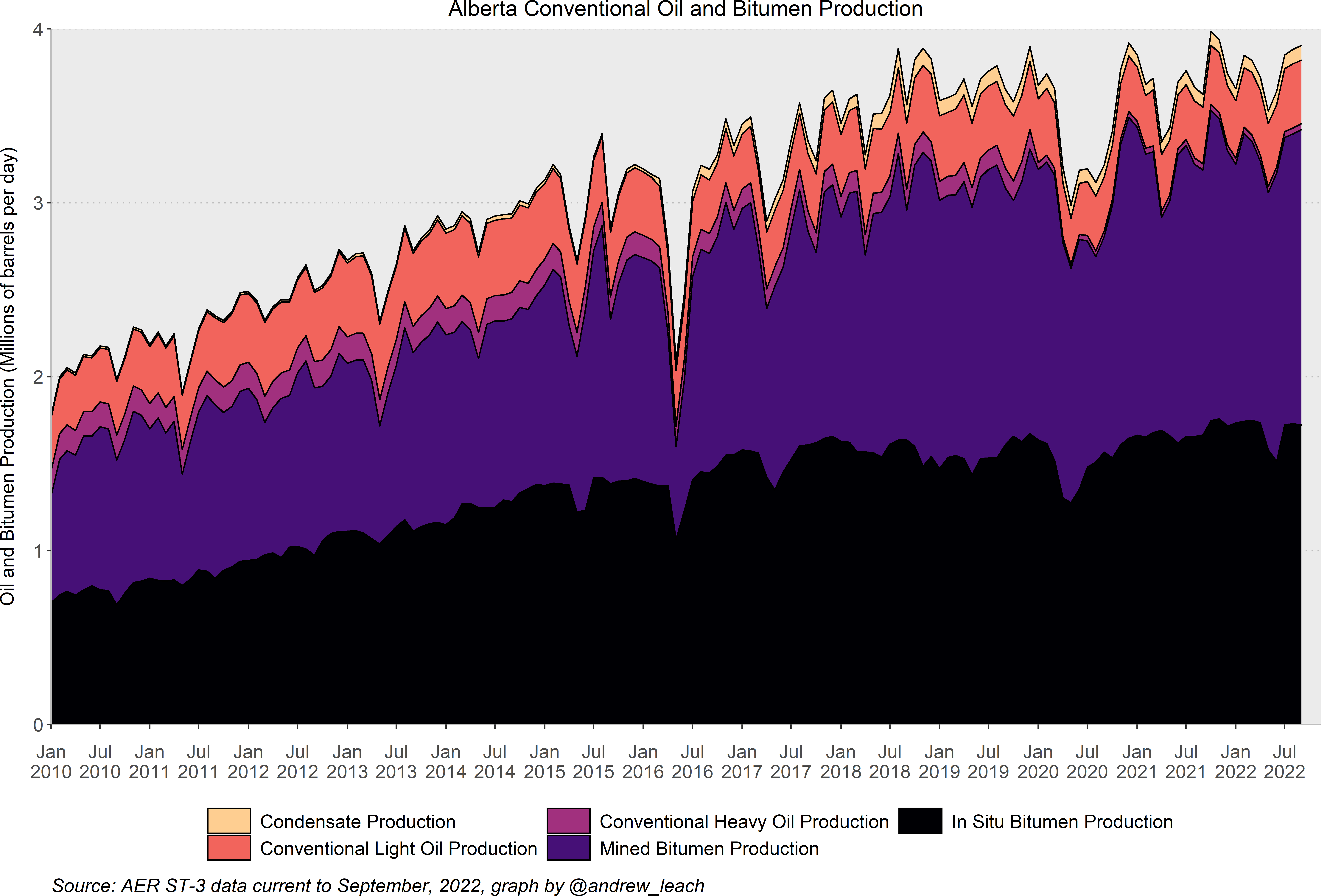
Closer to home, I had the opportunity to present this week to the Alberta Energy Regulator on some of my work on hydrogen. Since I’ve added a few new AER readers to the charts, I should include the latest oil production data from the ST-3 report, for which I have a regular scraper on my website. Watch for some new AER data products coming over the next month or so.
Finally, over the next couple of weeks, the EIA is changing to their new API which will definitely cause some Energy Charts hiccups, since we scrape directly from their API for many of our charts. We’ll try to make this as seamless as possible, but please keep us and other energy chart makers in your thoughts this month as we deal with these changes.
Have a great weekend, all.