
Hope you’re all having a great weekend. It’s been a busy last couple of weeks as the term starts to wind down. This weekend is no exception, as I’m staring at a big pile of grading.
I’ve posted an update to our energy charts at aleach.ca/charts.
This week, we’ve got a wealth of student stories, mostly because I missed last week’s update. We’ve got stories on a hydrogen community in Strathcona County, the looming battery boom in the US, Pakistan's Renewables Roadmap, residential solar and Alberta hydro power potential.
This week was the Alberta budget, and a return to trend in some ways with a very spendy budget from the Smith government. During budget week, there is no better source for analysis and visuals than the University of Calgary’s Trevor Tombe. I’ve got a few favourite Tombegraphs for the week, and so I thought I’d lead this post by sharing them.
First, this really brings home the degree to which we have become more dependent than ever on oil in Alberta: the sensitivity of government revenues to WTI prices is now up to over $800 million dollars, and has been on a steady climb as more oil sands projects reach payout and as capital investment has lagged revenues in the oil sands.

But, I think the Tombegraph of the week for the budget for me was this one, which really solidifies how much Alberta’s fiscal path has changed over the past 5 years (although, to be fair, taking out COVID and interest expenses does miss part of the true story here). Pre-pandemic, the Kenney government set Alberta on a very clear path - a significantly different one from that of the NDP government. But, it was also a path that seems to have led Albertan conservatives to discover that Albertans may not be quite that conservative. It turns out that, at a time when everything is costing people more, the message from government that we needed to make do with less service and be happy paying more it was not a popular one. As a result, we’ve seen a big shift in this pre-election budget. A shift to the most expensive government we’ve ever had in Alberta.

We also have a few new charts in this week’s update which I’d like to highlight for you.
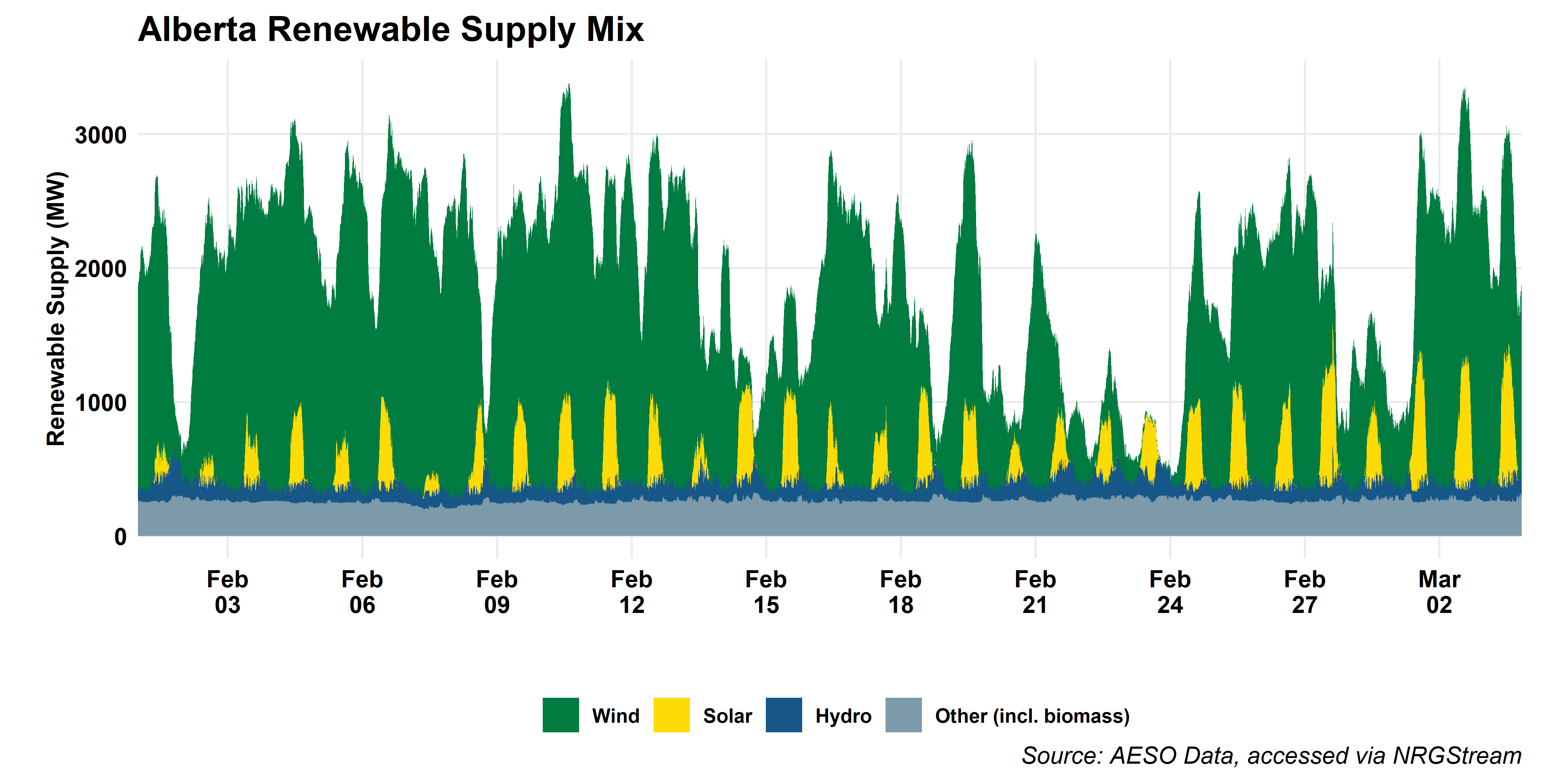
First, we’re highlighting renewable power generation in Alberta in a new plot. The rise in renewables here has been staggering, and raises some new challenges for the electric system operator, so this one is worth a look.
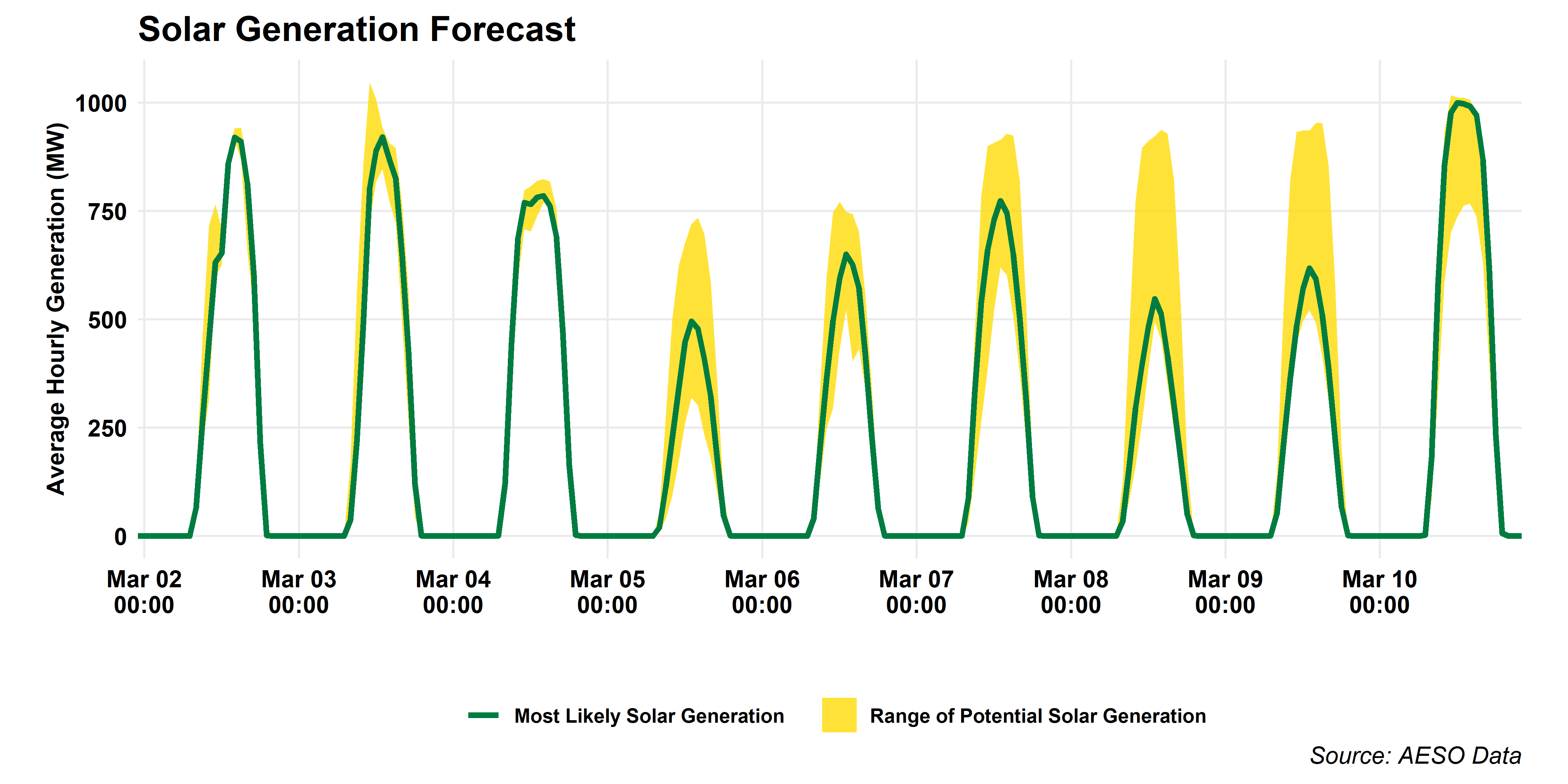
We’ve also added a graph of the AESO’s solar forecast. As we move into spring, Alberta’s new solar capacity is going to show itself more and more. We hit and all-time record this week (March 1) with 968MW of solar supply averaged over an hour, and we’re heading for a big milestone this week with a forecast by the end of the week of over 1GW of solar supply. With 1165MW (1.165 GW) of industrial solar installed on the grid today (not including distribution-connected and microgenerator systems), any new records set this week will be short-lived.
And, finally for this week, another electricity graph: forward prices. We’ve had this as a product in the charts pack for a while, but the plot was due for a refresh, so here’s a new one for you. We’ve added in average monthly prices over the preceding year for context.
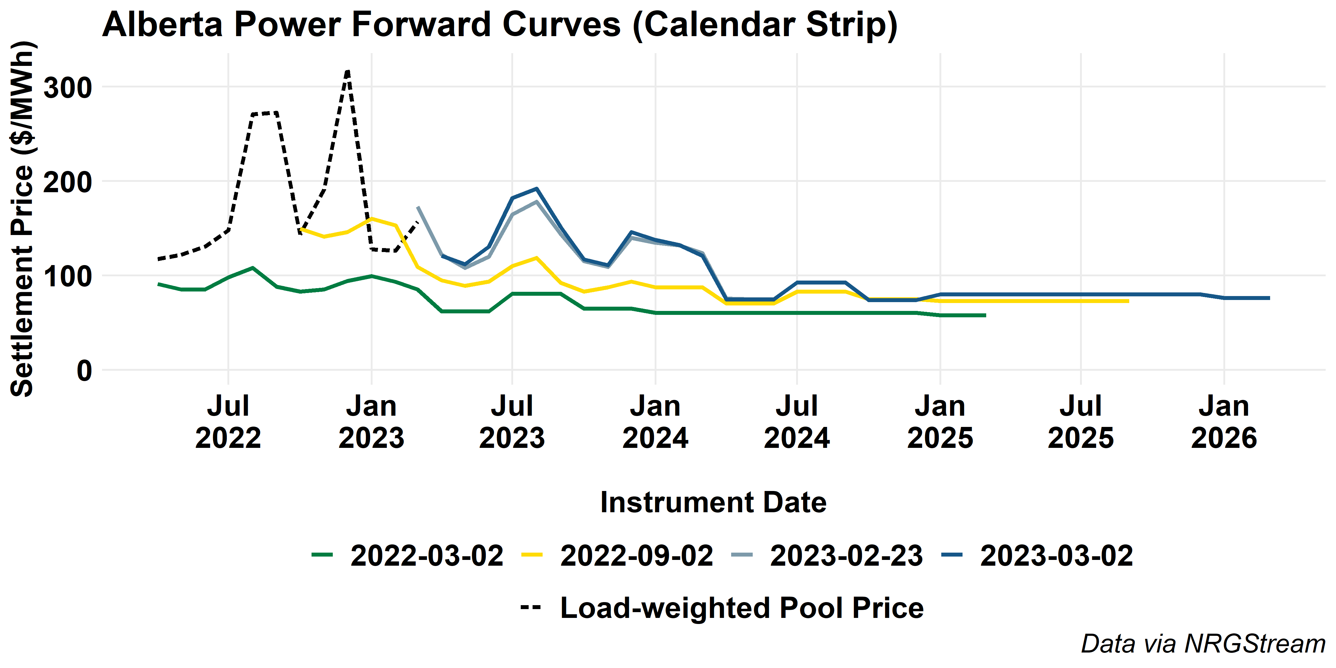
There’s a bit of good news and a bit of bad news in here for consumers. The forward market suggests lower prices this summer than last, but also shows that expectations for this summer’s prices have increased dramatically over time. This summer’s prices could bring a double-whammy for some consumers as the government’s price cap comes off regulated prices, and consumers on the regulated rate option will have to pay back the cost of the price cap on top of their regular power bills for the balance of the year.
Hope you all have a great weekend!