

Happy New Year
Coal, lithium, oil and gas investment, and Alberta power and gas prices

Happy New Year!
Today’s updated energy charts are posted at https://aleach.ca/charts.
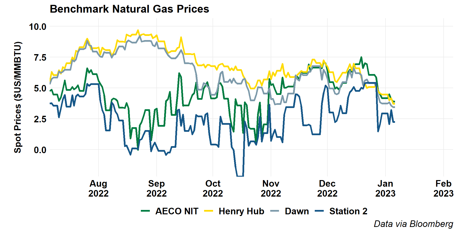
For me, the most striking charts this week are in the natural gas section, with the global benchmarks chart showing the drop in European gas prices back to pre-Russian-invasion levels. This year, a warm winter in Europe is good news.

North American hub prices are also down strikingly from laste summer highs, in particular in Ontario and on the US Gulf Coast. Alberta and BC prices have been all over the map this Fall, so it’s hard to say whether we call this past month an increase or a decrease!
Our students have a couple of stories this week on coal, one on Alberta employment and the latest spat with Ottawa, and one on lithium markets this week. As I always tell my students, there’s an IEA report for every viewpoint, you just have to look. This week, Yousaff is reporting on the IEA’s coal report, which showed new record coal demand. And, Marc’s got a little plug for yours-truly on the federal Just Transition legislation. Erica’s lithium story serves to tee-up my first little tidbits of the week below.
Lithium was already on my mind after one of my favourite Twitter follows, Hannah Ritchie at Our World In Data, had a great thread on lithium reserves and resources, and Rory Johnson was tweeting about reserves and resources and how these numbers tend to lead people to panic. I want to highlight a couple of graphs from Dr Ritchie’s thread here.


The first graph in Dr. Ritchie’s thread is similar to graphs which we’ve seen for countless resources over time, yet one from which we never learn the appropriate lessons. Reserves are not, at least in any limited sense of the word, a physical concept. They are an economic concept - the ultimate endogenous variable. We don’t explore for that which we don’t value, nor in areas in which we are confident that any resource that exists could not be profitably extracted. Of those resources we do find, only those which are technically and economically (read: profitably) recoverable count as reserves. And, if you’re getting down to corporate reserves (the 1P and 2P reserves in a company’s annual reporting), those essentially boil down to a high-confidence production forecast conditioned on a price outlook. The amount of a resource that may be recoverable (and thus converted to reserves) under different pricing and technology assumptions can be radically different. And, that’s part of why Dr. Ritchie’s first graph is not surprising at all: the global lithium market has changed dramatically, as Erica’s story this week shows, and so more of the lithium we know about is now expected to be economically recoverable.

The next graph in Dr. Ritchie’s thread also shows that we’re finding more lithium. Again - the market has led to us to look for it, and we’re finding it.

Worries that we’re not going to have enough resources are as old as mineral resource use. This thread led me to take a wander back in time to the 1860s and William Stanley Jevons (yes, the Jevons paradox guy) and his book The Coal Question where, not surprisingly, he’s worried about coal stocks.
This is an important question because, you see, there are no real substitutes for coal.

And we’re going to run out and it’s going to be bad.

Of course, we’ve found many substitutes for coal in most of its 1860s uses (steelworks remain very coal-centric) and, as if to put a fine point on this, more than 160 years after Jevons’ worrying, the UK just announced the permiting of a new coal mine! And, of course, as Yousaff reports, we just saw record global coal consumption.
Other than coal and 1860s energy fears, I have a few other things to bring your way this week.
First, the quarterly oil and gas finance survey from the EIA is up. It was up a bit earlier than expected, so I’m late to it. I’m never sure why these reports get so little play (maybe because they’re buried on the site and the data aren’t in the API?) but they have some important information. This graph, showing than Q3 capital expenditures was the first quarter in which we saw the oil and gas industry back to pre-pandemic capital expenditure levels was the most striking.
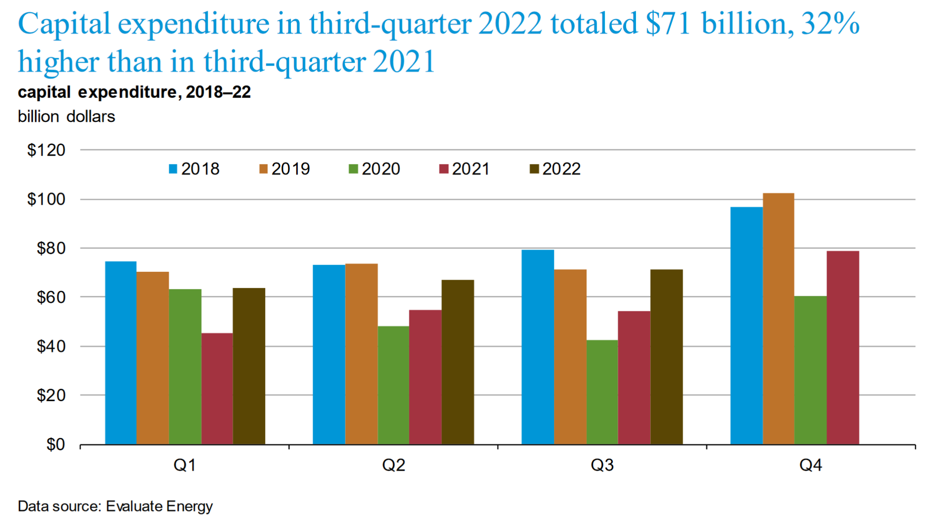
Let’s take a bit of a deeper look though. One of my issues with this report is that they don’t report with a long time-series in the quarterlies, but they do have some longer graphs in their annual report. So, let’s zoom out and back to reports from a few years back. If you’ll note the y-axis, you’ll see that the expenditures we’re reporting for Q3 2022 right now are about $70 billion, while Q3 2015 (which was just as things were really crashing globally) was down to $80 billion (in money of the day).

On this December’s graph, the 2018 data look like a boom. Well, this visiual should remind you all of how that year compares to what was happening in 2014, for example.

And, before I move on, I should remind you of one more thing that you can get from these reports: a sense of how investment in oil and gas has evolved globally by country and year (only in the annual report).
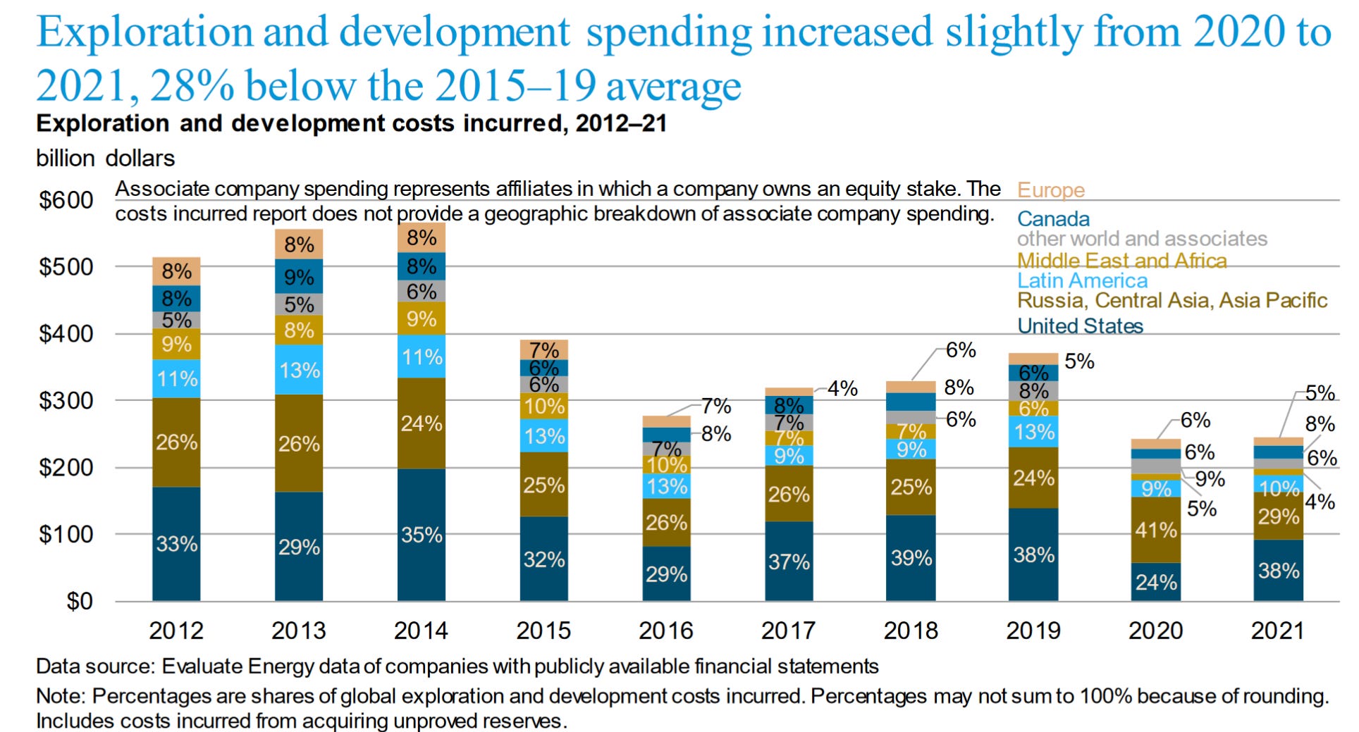
This is always my favorite graph, since it reminds us all just how far reaching the Notley-Trudeau alliance really was. They single-handedly cut global oil and gas investment in half, and it’s never recovered.
And, the last bit before I get back to course prep: Alberta gas and electricity prices. We had a great thread this morning from Blake Shaffer showing people that power forward prices remain well-above the current offered fixed price regimes, especially when you account for the fact that staying on the regulated rate option price will include paying back the government caps through deferral accounts later on. But, it’s the second graph in the thread that’s really interesting. Natural gas has now dropped enough that forward contracts are settling below the fixed price offerings available right now for Alberta consumers. Professor Shaffer says it’s time to float!


With natural gas prices well below $5, it’s really striking that power forwards haven’t moved much at all. Must be the carbon tax...
Have a great week, and wish me better computer luck next week!