Econ 366 Charts Week Winter 2024 Edition
Everyone loves a chart-off!

A little over a year ago, I started teaching energy economics in the Department of Economics at the University of Alberta, and I put a lot of emphasis on data visualization during the class. My students endure several R data exercises and assignments in which I attempt to familiarize them with both data visualization tools and the data itself. They study global primary energy supply using the BP Statistical Review, oil prices using EIA data, solar power using data from my own household array, and Alberta electricity loads and prices using the AESO API.
And now, it’s time for the payoff.
I give them one last assignment inspired by Jason Kirby’s annual economists’ charts week, and have them pick a chart that they really find impactful, interesting, or which tests their R skills. And, this year some of the products are great. And seeing some of the students go from struggles with R to producing great, original work is the best part of my term.
You can see all the charts here.
Many of my students have shared contact info, mostly via LinkedIn. Please reach out to the students if you like their work. Hire them if you have a job opening. Pass their work on to others who might want to see it. And, if you don’t like a chart, please keep it constructive or keep it to yourself. I want them to feel great about the work that they’ve done.
Let me highlight a few charts that I really like and tell you a bit about why:
The most eye-catching chart (and one that I was really pleased to see) was from Ethan Griffiths on electricity generation in Canada vs. the UK. Ethan is from the UK, so after we’d done similar graphs to this with Canadian data, he decided to build a comparison. I was really pleased with this addition and I learned a lot about UK electricity supply too.

Continuing on with electricity, and using some of the same data as Ethan, Claire Hughes shows how different emissions constraints might change electricity supply in Canada. This is, I think, the best aesthetic graph of the bunch and really shows the importance of hydro and nuclear power to Canada’s energy mix too. Don’t get too mad that she left out some big players (Manitoba, Newfoundland and Labrador) in the hydro space.

Next, Business student Austin Hanlan has a nice take on the recently-released oil sands emissions intensity data from the Government of Alberta. You can see the long term improvement in in situ production as well as the oil sands average, but the lack of progress in the past few years is depressing.

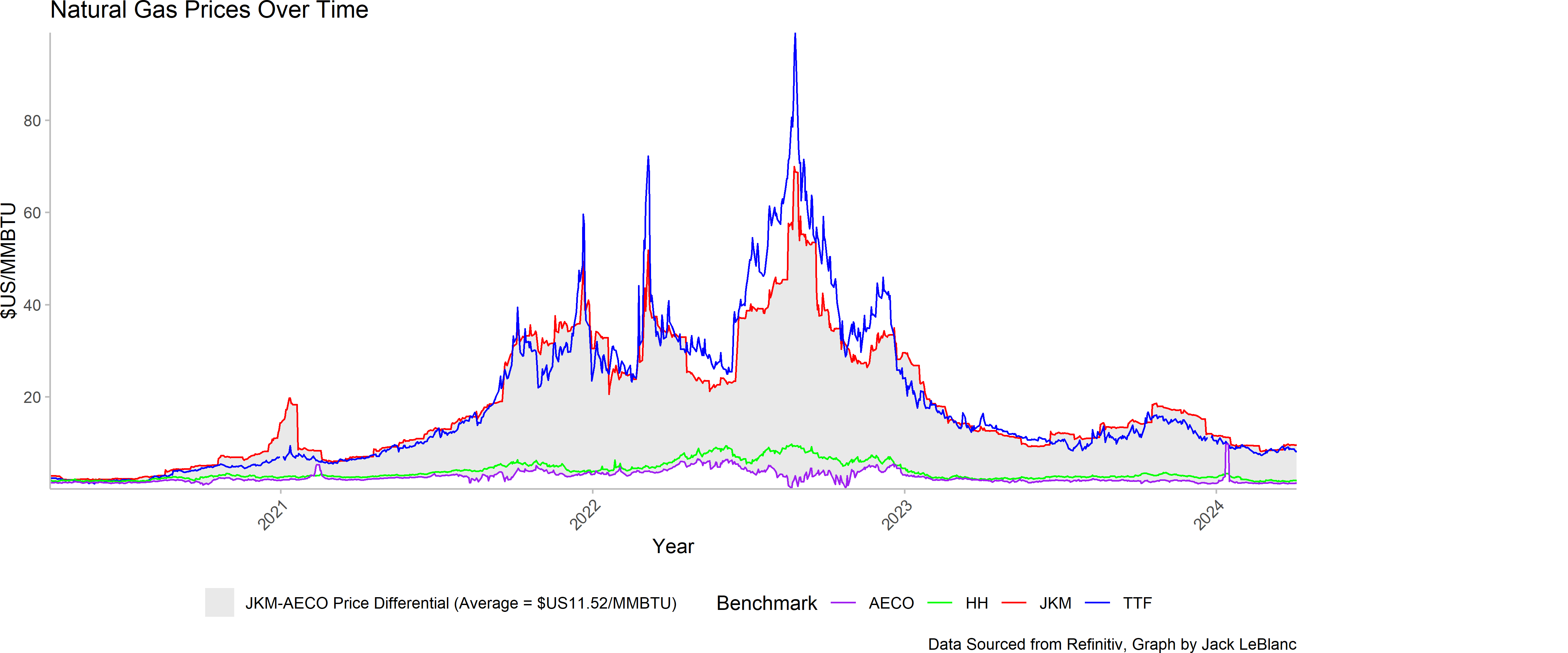
I try to get our students to think about current policy challenges in class, and one that we didn’t get much of a chance to talk about this year was LNG. Jack Leblanc brings the LNG discussion to Charts Week with a nice chart showing the differential between Alberta (AESO), Asian (JKM), and European (TTF) gas prices. I told Jack today that this would be a fun graph to combine with Google Trends data for LNG.
Next, we’d remiss if we didn’t have a graph showing consumer carbon pricing impacts, so this one from Ghunaym Yahya. It’s remarkable to think of just how expensive gas was pre-2008. In today’s dollars, those 2006 gas prices are about $22/GJ. Yes, the carbon charge delivers a big boost in natural gas costs, in percentage terms, but all-in gas today remains remarkably inexpensive in real dollar terms.

Now, I’m biased on this last one: economics student Seth Germsheid looks at the evolution of emissions from electricity generation in Alberta and the implementation and evolution in carbon pricing. There’s a lot in this plot, but the acceleration in coal phase-out and the increase in gas generation that followed from the strengthening of the carbon pricing signal (and the TIER modifications from the Kenney government too) are such a remarkable sight to see on a plot.

I hope you all enjoy the charts and please, connect with the students on LinkedIn, tell them you liked their work, and please share this post. And, most of all, constructive criticism and positive reinforcement only please. I ask a lot of my students in making these public. Don’t make it a bad experience for them!
great charts! I especially love that last one (for vanity reasons of course!) So cool to see the scope of that work.
I teach a class on energy, I’m definitely going to make a chart a deliverable on the course!
Some nice work here! Congrats.