

Econ 366 Charts Week, Fall 2023 Edition
My students' chance to show off their energy data visualization skills

It’s been far too long since I’ve written on here. Why? Mostly, I’ve been busy with a new book and my usual teaching. I was also foiled by the EIA’s API update and I just haven’t been able to get my charts macro working.
But, that’s all in the past.
Today’s a new day and do I ever have a great post for you.
Last year, I started teaching energy economics in the Department of Economics at the University of Alberta, and I put a lot of emphasis on data visualization during the class. I want students to learn through looking at, wrangling, and presenting data. And, the students have suffered through 10 R assignments on everything from global primary energy supply to AESO electricity loads and prices to my household solar power system.
And now, it’s time for the payoff.
I give them one last assignment modeled off Jason Kirby’s annual economists’ charts week, and have them pick a chart that they really find impactful, interesting, or which tests their R skills. And, this year some of the products are great.
You can see all the charts here.
Reach out to the students if you like their work. Hire them if you have a job opening. Pass their work on to others who might want to see it. And, if you don’t like a chart, please keep it constructive or keep it to yourself. I want them to feel great about the work that they’ve done.
Let me highlight a few that I really like.
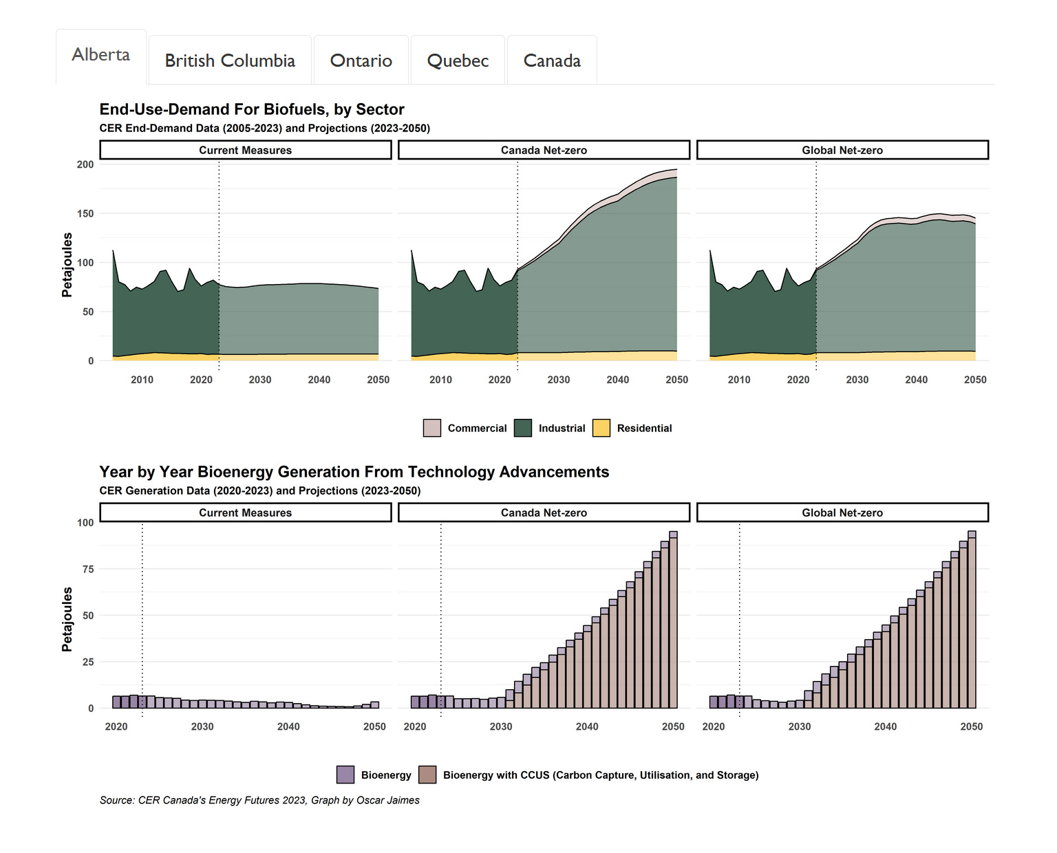
First up is Oscar Jaimes’ chart on biofuels. Oscar has really done some great work this year, including being one of only a couple of people to do course assignments in both R and Python. This one really shows off Oscar’s skills.
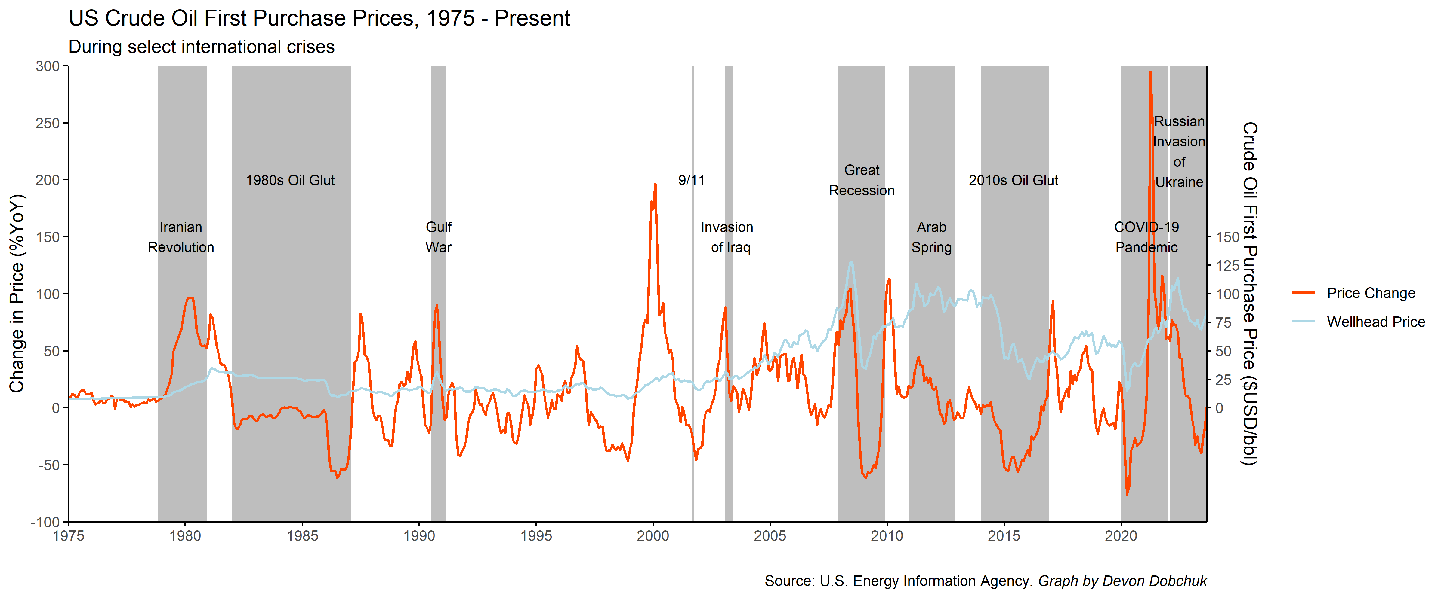
ALES student Devon Dobchuk is right in my wheelhouse with an oil history chart, and I’m really thrilled. The recent volatility, in context, really jumps out!
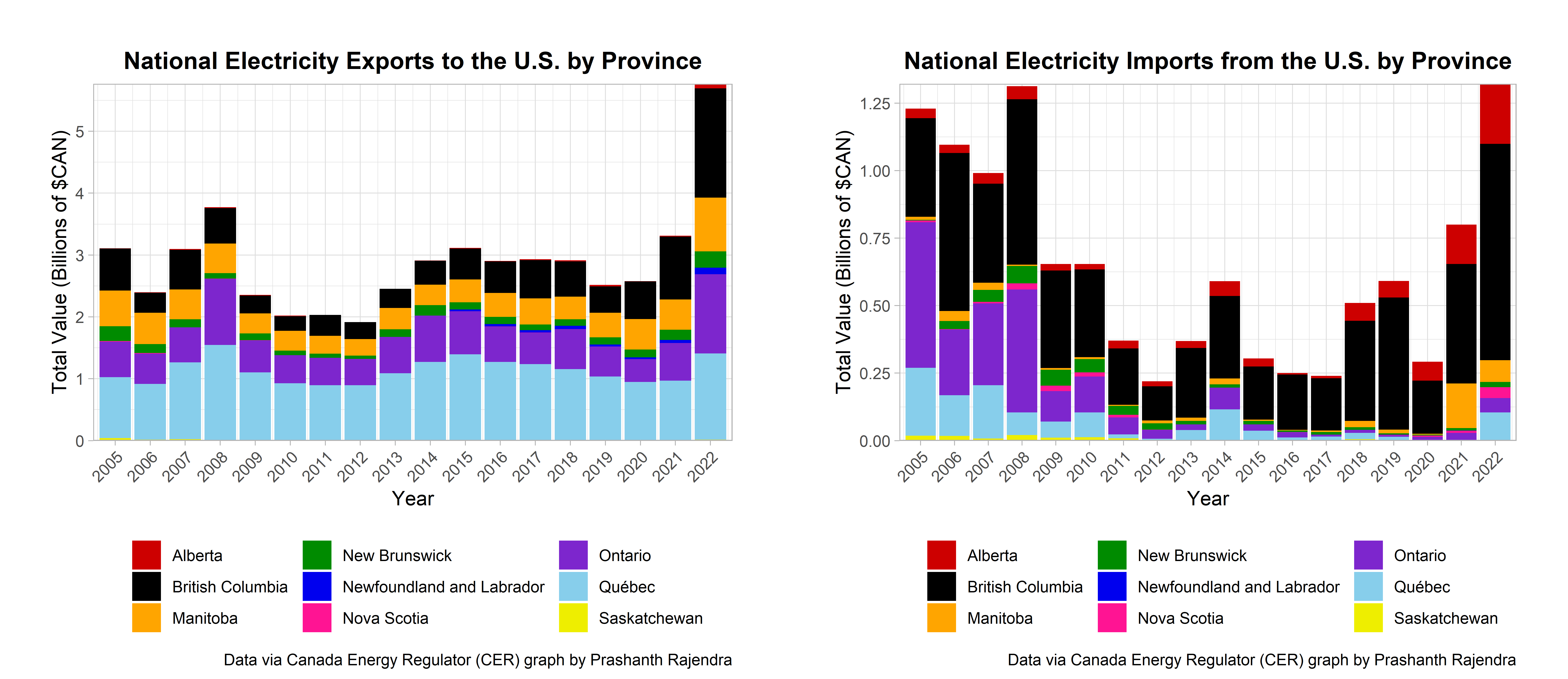
I liked Prashanth Rajendra’s electricity chart mostly because it surprised me how volatile these values are. I don’t think I’d ever seen imports graphed like this, so I was taken by it. And, we’re going to talk a lot more about electricity in the coming year, so it’s a nice fit.
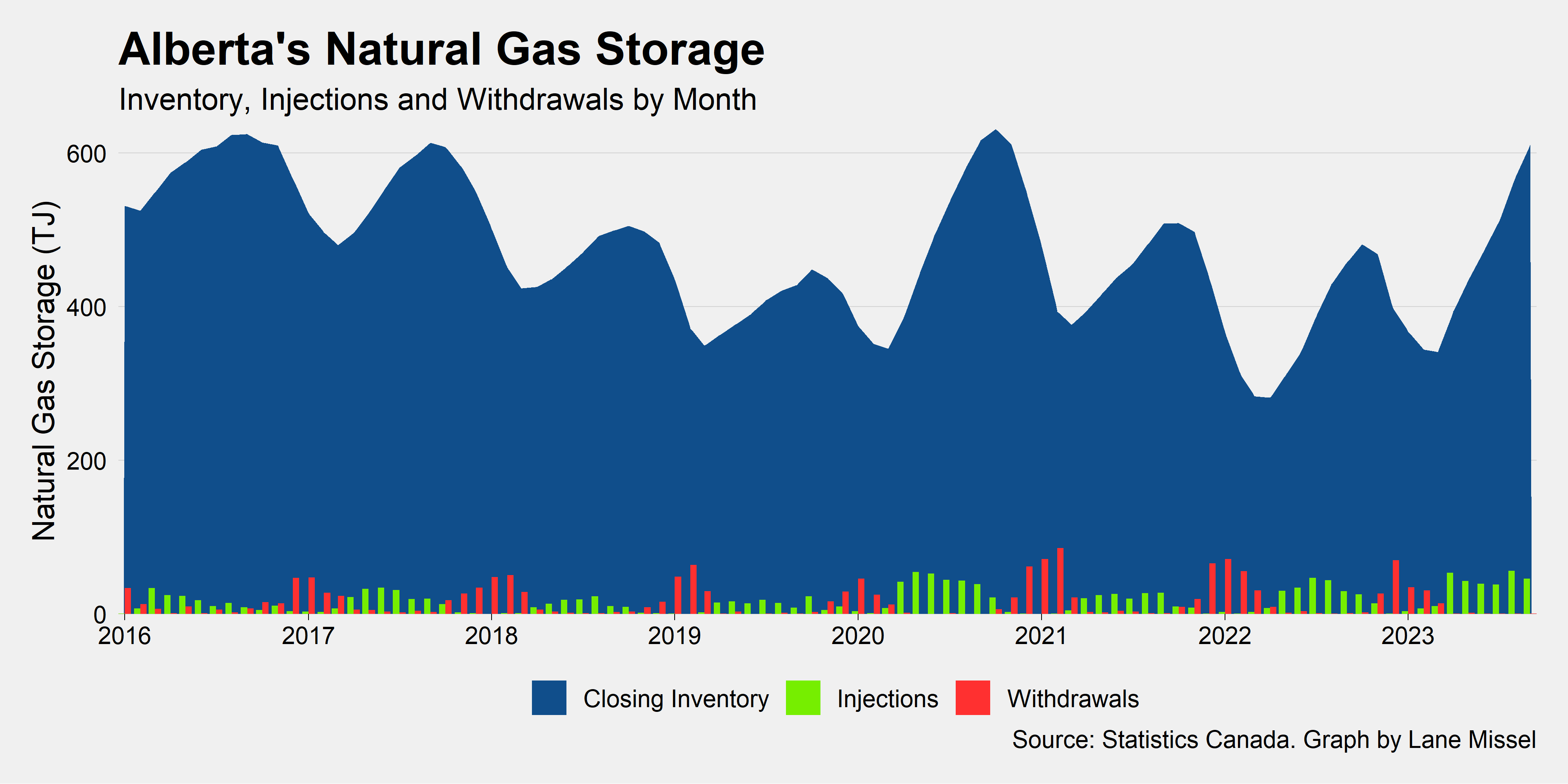
Lane Missel used a fivethirtyeight graph template all term, and I’ve now adopted a modified version of it for some of my own work. This is a really neat graph on gas storage cycles too.
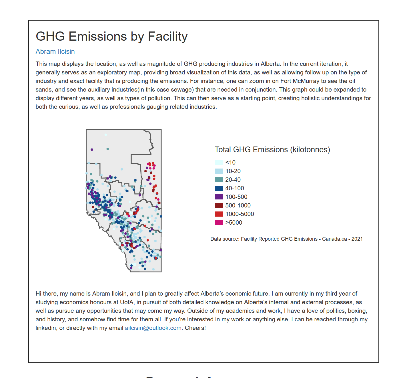
And, finally, I think the star of the show this year is Abram Ilcisin’s Shiny app for emissions data. We don’t do Shiny in class, but this was a great piece of work and I learned how to embed Shiny in RMarkdown as a result too!
I want to conclude with one important detail on Charts Week. It’s optional. I don’t make it mandatory for students to do, nor do I make it mandatory for students to publish their charts if they would prefer to remain anonymous. There were several students who didn’t submit because they already had perfect grades in R assignments, and so had nothing to gain from spending time fighting with R this week instead of preparing for finals. Others chose not to have their charts published. Rest assured that, in addition to these great examples of energy data visualization, there are many great students in my class that you don’t see on the charts page, including some with some stellar R skills. I’m always happy to connect them to great opportunities.
This is always such a pleasure to post and I hope you enjoy it as much as I do.